Day 1: Visualising Scale
Today we were introduced to the web-based presentation software Prezi. It can be used to make very flashy-looking presentations which can zoom in-and-out and move around different spatial planes, enabling the viewer to focus in on different details.
Bob Levene mentioned the similarities between Prezi’s zoom affect and the groundbreaking Charles and Ray Eames film Powers of Ten from 1977.
I watched the film and became interested in using the Prezi software as a tool for visualising scale – enabling the viewer to see very large things in proportion to very small.
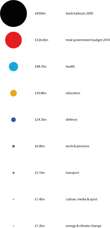
Following last week’s controversial Spending Review, I was particularly interested in visualising the amount of money which the UK government had gifted to the banks in the 2009 bailouts in comparison to the annual expenditure of different government departments such as Culture, Media and Sport, which had be subject to disproportionate cuts.
I used Illustrator to create a graphic in which these different amounts were visualised proportionally in colour-coded circles. I calculated the diameters of each circle by using each number in billions-of-pounds as the ‘area’ in an online circle calculator.
I imported my graphic and then used Prezi to make a series of ‘paths’, which would take the viewer on a tour around the different departmental budgets – zooming-in and then out to give an idea of proportionate scale.
You can view my first experiment in Prezi above in conjunction with the key below in order to determine which government department’s 2010 budget each circle refers to. The big black circle represents the money used for the bank bailouts in 2009.

